← Back to blog

Animating a Shopify Theme With GSAP in Minutes

By Nicholas Drishinski ·
Adding smooth, professional animations to your Shopify theme can significantly enhance user experience and make your store stand out from the competition. In this guide, we'll walk through how to implement GSAP (GreenSock Animation Platform) animations in your Shopify theme, specifically focusing on homepage animations.


Prefer video?

Enjoy, otherwise read on!


What is GSAP?


GSAP is a powerful JavaScript animation library that provides smooth, performant animations for web elements. It's particularly well-suited for e-commerce sites because it's lightweight, cross-browser compatible, and offers precise control over animation timing and easing.


Step 1: Adding GSAP to Your Theme 

The first step is to add GSAP to your Shopify theme. We'll add it to the `theme.liquid` file, which is the main layout file that wraps around all your theme's pages.

Locating theme.liquid

1. In your Shopify admin, go to **Online Store > Themes**
2. Click **Actions > Edit code** on your theme
3. Navigate to `layout/theme.liquid`

Adding the GSAP Script

Add the following code to your `theme.liquid` file, preferably in the `<body>` section before the closing `</body>` tag:


<script src="https://cdnjs.cloudflare.com/ajax/libs/gsap/3.12.5/gsap.min.js"></script>
<script>
  document.addEventListener("DOMContentLoaded", () => {
    const fasterDuration = 0.3;
    const slowerDuration = .5;

    const tl = gsap.timeline({
      defaults: { ease: "power2.out", duration: fasterDuration },
    });

    // Logo first
    tl.from("LOGO", {
      opacity: 0,
      duration: slowerDuration,
      ease: "power3.out",
    })

      .from("MOBILE-DRAWER", {
        opacity: 0,
        y: -20,
      }, "-=0.15")

      // Then navigation links, icons, and menu — one after another (slight overlap)
      .from("HEADER-LINKS", {
        opacity: 0,
        y: -20,
        stagger: 0.08,
      }, "-=0.2") // start just before logo finishes

      .from("HEADER-ICONS", {
        opacity: 0,
        y: -20,
        stagger: 0.08
      }, "-=0.15")

      // Then hero section — starts right after nav animations
      .from("HERO-BANNER-HEADING", {
        opacity: 0,
        y: 30,
        duration: slowerDuration,
        ease: "power2.out",
      }, "-=0.1")

      .from("HERO-BANNER-TEXT", {
        scale: 0.8,
        opacity: 0,
        ease: "back.out(1.7)",
      }, "-=0.25")

      .from("HERO-BANNER-BUTTON", {
        scale: 0.8,
        opacity: 0,
        ease: "back.out(1.7)",
      }, "-=0.25");
  });
</script>

Step 2: Understanding the Animation Selectors

The animation script above uses placeholder selectors like "LOGO", "HEADER-LINKS", etc. These need to be replaced with actual CSS selectors from your theme. Here's how to find and use the correct selectors:

### Finding Your Theme's CSS Classes and IDs

1. **Open your website in a browser**
2. **Right-click on the element you want to animate**
3. **Select "Inspect Element"**
4. **Look for the CSS class or ID in the HTML**

### Common Shopify Theme Selectors

Based on the theme structure, here are some common selectors you might use:

#### Header Elements
- **Logo**: `.header__heading-logo` or `.header__heading-link`
- **Navigation Links**: `.header__menu-item` or `.header__inline-menu .list-menu__item`
- **Header Icons**: `.header__icons` or `.header__icon`
- **Mobile Menu**: `.mobile-menu` or `.menu-drawer`

#### Hero/Banner Elements
- **Hero Heading**: `.banner__heading` or `.hero-heading`
- **Hero Text**: `.banner__text` or `.hero-subtext`
- **Hero Button**: `.banner__buttons .button` or `.hero-button`

### Updating the Animation Script

Replace the placeholder selectors with your actual CSS selectors. For example:

```javascript
<script>
document.addEventListener("DOMContentLoaded", () => {
const fasterDuration = 0.3;
const slowerDuration = .5;

const tl = gsap.timeline({
defaults: { ease: "power2.out", duration: fasterDuration },
});

// Logo animation
tl.from(".header__heading-logo", {
opacity: 0,
duration: slowerDuration,
ease: "power3.out",
})

// Mobile drawer animation
.from(".menu-drawer", {
opacity: 0,
y: -20,
}, "-=0.15")

// Navigation links animation
.from(".header__menu-item", {
opacity: 0,
y: -20,
stagger: 0.08,
}, "-=0.2")

// Header icons animation
.from(".header__icons", {
opacity: 0,
y: -20,
stagger: 0.08
}, "-=0.15")

// Hero banner heading
.from(".banner__heading", {
opacity: 0,
y: 30,
duration: slowerDuration,
ease: "power2.out",
}, "-=0.1")

// Hero banner text
.from(".banner__text", {
scale: 0.8,
opacity: 0,
ease: "back.out(1.7)",
}, "-=0.25")

// Hero banner button
.from(".banner__buttons .button", {
scale: 0.8,
opacity: 0,
ease: "back.out(1.7)",
}, "-=0.25");
});
</script>
```

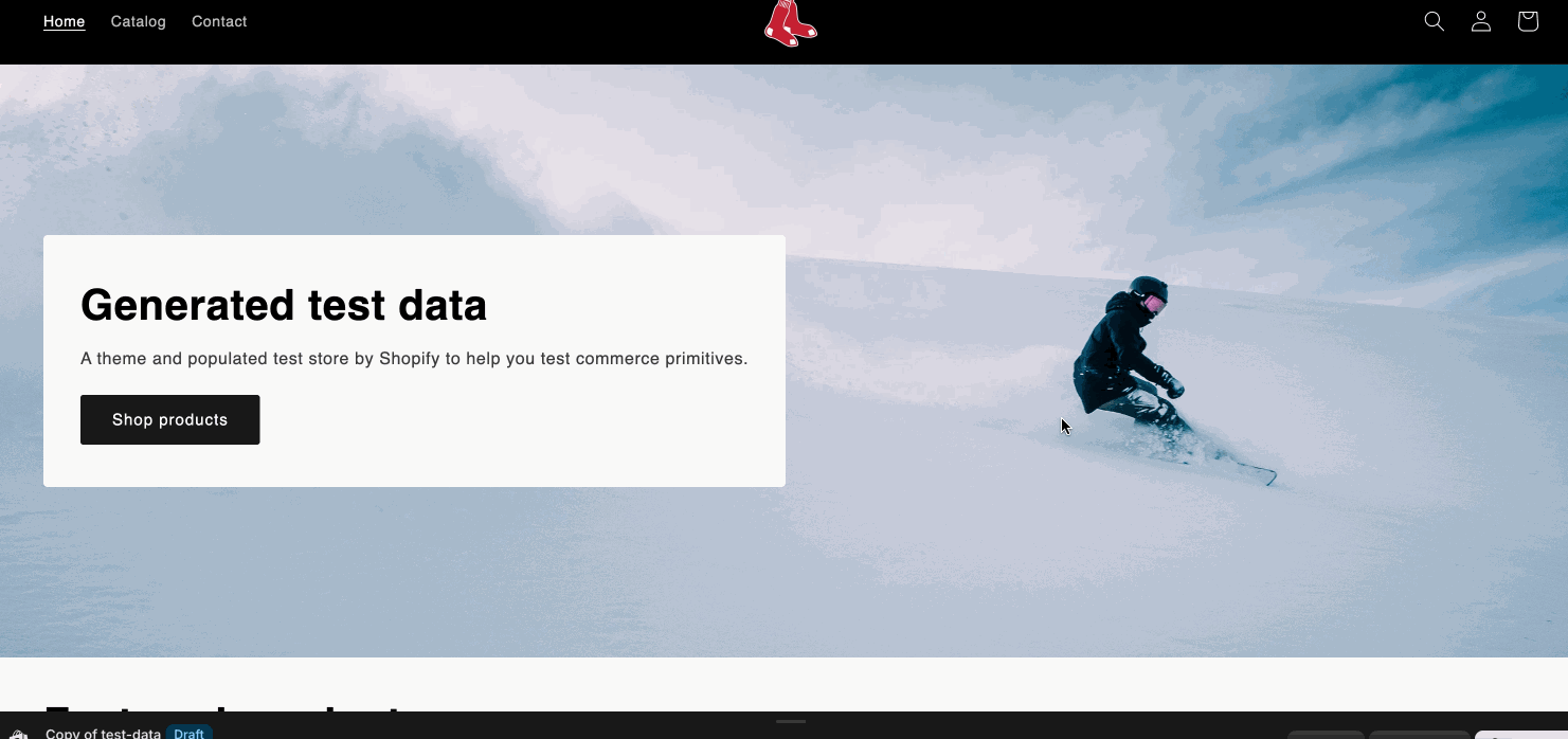
You should use the 'inspect' element on your browser by right clicking and clicking 'inspect'. From there you can select the item you want to animate and find the 'class' or 'id' that is attached to the element. (I recommend watching the video for more details on how to accomplish this).

Step 3: Customizing Your Animations


### Understanding the Animation Properties

- **`opacity: 0`**: Starts the element invisible
- **`y: -20`**: Moves element 20px up from its final position
- **`scale: 0.8`**: Starts element at 80% of its final size
- **`stagger: 0.08`**: Delays each element by 0.08 seconds (for multiple elements)
- **`"-=0.15"`**: Starts this animation 0.15 seconds before the previous one ends

### Popular Animation Effects

#### Fade In from Bottom
```javascript
.from(".your-selector", {
opacity: 0,
y: 30,
duration: 0.6,
ease: "power2.out"
})
```

#### Scale In
```javascript
.from(".your-selector", {
scale: 0.8,
opacity: 0,
duration: 0.5,
ease: "back.out(1.7)"
})
```

#### Slide In from Left
```javascript
.from(".your-selector", {
x: -50,
opacity: 0,
duration: 0.6,
ease: "power2.out"
})
```

#### Staggered Animation (for multiple elements)
```javascript
.from(".your-selector", {
opacity: 0,
y: 20,
stagger: 0.1,
duration: 0.5
})
```

Step 4: Testing Your Animations


1. **Save your changes** in the theme editor
2. **Preview your store** to see the animations
3. **Test on different devices** to ensure compatibility
4. **Adjust timing and effects** as needed

Conclusion

GSAP animations can transform your Shopify store from static to dynamic, creating engaging user experiences that encourage visitors to stay longer and convert better. Start with simple animations and gradually add more complex effects as you become comfortable with the syntax.

Remember to test your animations across different devices and browsers, and always prioritize user experience over flashy effects. Subtle, smooth animations often work better than dramatic ones for e-commerce sites.

Happy animating!