← Back to blog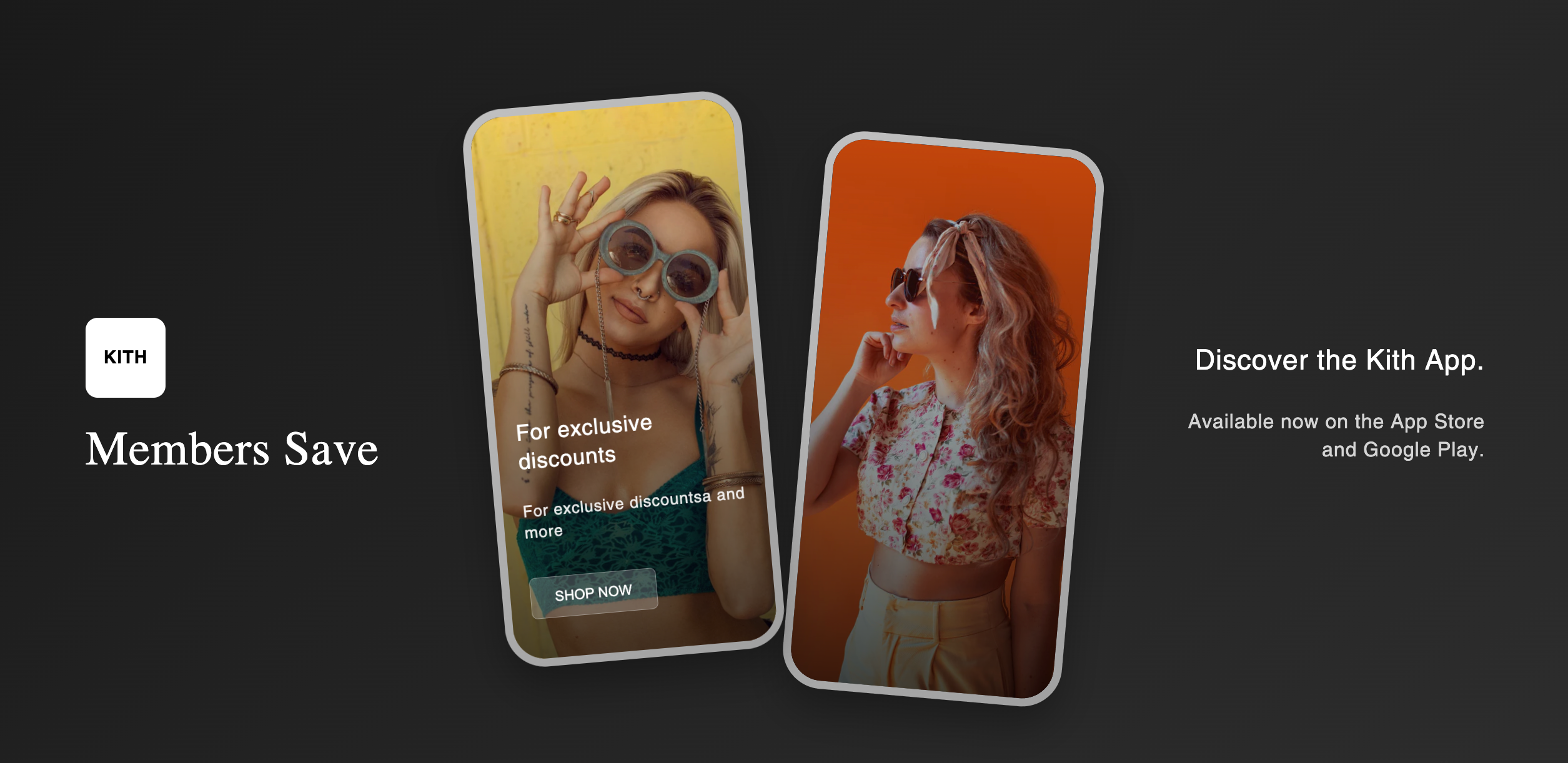

Add an App-Style Section with Dual Phones to Shopify (copy/paste)
By Nicholas Drishinski ·
Are you looking to showcase your mobile app, promote app downloads, or create an engaging visual element on your Shopify store? A phone screen section is the perfect way to display mobile content in an attractive, realistic phone mockup. In this guide, we'll walk you through how to add a professional phone screen section to your Shopify store.
Code: https://github.com/ndrishinski/blogs/blob/master/phone-screen-section/sections/phone-screen.liquid
Prefer video?
Enjoy, otherwise read on!
What is a Phone Screen Section?
A phone screen section displays content within realistic phone mockups, making it perfect for:
- Promoting your mobile app
- Showcasing mobile-specific features
- Displaying app screenshots
- Encouraging app downloads
- Creating visual interest on your homepage
Features of This Phone Screen Section
The section we'll be implementing includes:
- Two phone mockups with realistic 3D styling
- Customizable background images for each phone
- Overlay text and buttons on phone screens
- Responsive design that works on all devices
- Professional styling with gradients and shadows
- Easy customization through Shopify's theme editor
Step-by-Step Implementation
Step 1: Create the Section File
1. Navigate to your Shopify admin panel
2. Go to **Online Store** → **Themes**
3. Click **Actions** → **Edit code**
4. In the left sidebar, navigate to **Sections**
5. Click **Add a new section**
6. Name it `phone-screen.liquid`
Step 2: Add the Code
Copy and paste the following code into your new section file:
<style>
  .kith-app-section {
    width: 100%;
    height: 800px;
    background: linear-gradient(135deg, #1a1a1a 0%, #2d2d2d 100%);
    display: flex;
    align-items: center;
    justify-content: center;
    padding: 40px 20px;
    position: relative;
    overflow: hidden;
  }

  .kith-app-container {
    max-width: 1400px;
    width: 100%;
    display: grid;
    grid-template-columns: 1fr 2fr 1fr;
    align-items: center;
    gap: 60px;
    height: 100%;
  }

  .kith-branding {
    display: flex;
    flex-direction: column;
    align-items: flex-start;
    color: white;
  }

  .kith-logo {
    width: 80px;
    height: 80px;
    background: white;
    border-radius: 12px;
    display: flex;
    align-items: center;
    justify-content: center;
    margin-bottom: 20px;
    font-weight: bold;
    font-size: 18px;
    color: black;
  }

  .kith-title {
    font-size: 48px;
    font-weight: 300;
    color: white;
    margin: 0;
    font-family: serif;
  }

  .phones-container {
    display: flex;
    align-items: center;
    justify-content: center;
    gap: 40px;
    height: 100%;
    position: relative;
  }

  .phone-mockup {
    width: 280px;
    height: 560px;
    background: linear-gradient(145deg, #c0c0c0, #a0a0a0);
    border-radius: 40px;
    padding: 8px;
    box-shadow: 0 20px 40px rgba(0, 0, 0, 0.3);
    position: relative;
  }

  .phone-mockup:first-child {
    transform: rotate(-5deg) translateY(-20px);
    z-index: 2;
  }

  .phone-mockup:last-child {
    transform: rotate(5deg) translateY(20px);
    z-index: 1;
  }

  .phone-screen {
    width: 100%;
    height: 100%;
    border-radius: 32px;
    overflow: hidden;
    position: relative;
    background: black;
  }

  .phone-notch {
    position: absolute;
    top: 8px;
    left: 50%;
    transform: translateX(-50%);
    width: 120px;
    height: 24px;
    background: black;
    border-radius: 12px;
    z-index: 10;
  }

  .phone-content {
    width: 100%;
    height: 100%;
    background-size: cover;
    background-position: center;
    background-repeat: no-repeat;
    display: flex;
    flex-direction: column;
    justify-content: flex-end;
    padding: 40px 20px;
    color: white;
    position: relative;
  }

  .phone-content::before {
    content: '';
    position: absolute;
    top: 0;
    left: 0;
    right: 0;
    bottom: 0;
    background: linear-gradient(to bottom, transparent 0%, rgba(0, 0, 0, 0.7) 100%);
  }

  .phone-content > * {
    position: relative;
    z-index: 2;
  }

  .app-description {
    display: flex;
    flex-direction: column;
    align-items: flex-end;
    color: white;
    text-align: right;
  }

  .app-title {
    font-size: 28px;
    font-weight: 300;
    margin-bottom: 10px;
    color: white;
  }

  .app-subtitle {
    font-size: 20px;
    opacity: 0.8;
    line-height: 1.4;
    color: white;
  }

  .shop-button {
    background: rgba(255, 255, 255, 0.2);
    border: 1px solid rgba(255, 255, 255, 0.3);
    color: white;
    padding: 12px 24px;
    border-radius: 6px;
    font-size: 14px;
    font-weight: 500;
    cursor: pointer;
    transition: all 0.3s ease;
    margin-top: 20px;
    align-self: flex-start;
  }

  .shop-button:hover {
    background: rgba(255, 255, 255, 0.3);
  }

  /* Mobile Responsive */
  @media (max-width: 1024px) {
    .kith-app-section {
      height: 600px;
      padding: 20px;
    }

    .kith-app-container {
      grid-template-columns: 1fr;
      gap: 40px;
      text-align: center;
    }

    .kith-branding {
      align-items: center;
      order: 1;
    }

    .kith-title {
      font-size: 36px;
    }

    .phones-container {
      order: 2;
      gap: 20px;
    }

    .phone-mockup {
      width: 200px;
      height: 400px;
    }

    .app-description {
      order: 3;
      align-items: center;
      text-align: center;
    }

    .app-title {
      font-size: 20px;
    }

    .app-subtitle {
      font-size: 14px;
    }
  }

  @media (max-width: 768px) {
    .kith-app-section {
      height: auto;
      min-height: 500px;
      padding: 30px 15px;
    }

    .kith-app-container {
      gap: 30px;
    }

    .kith-title {
      font-size: 28px;
    }

    .phones-container {
      flex-direction: column;
      gap: 20px;
    }

    .phone-mockup {
      width: 180px;
      height: 360px;
    }

    .phone-mockup:first-child,
    .phone-mockup:last-child {
      transform: none;
    }

    .phone-content {
      padding: 30px 15px;
    }
  }
</style>

<section class="kith-app-section">
  <div class="kith-app-container">
    <div class="kith-branding">
      {% if section.settings.logo_text != blank %}
        <div class="kith-logo">
            {{ section.settings.logo_text }}
        </div>
      {% endif %}
      <h2 class="kith-title">{{ section.settings.title }}</h2>
    </div>

    <div class="phones-container">
      <div class="phone-mockup">
        <div class="phone-notch"></div>
        <div class="phone-screen">
          <div class="phone-content" style="background-image: url('{{ section.settings.phone_1_image | img_url: '600x' }}');">
            {% if section.settings.phone_1_title %}
              <h3 style="font-size: 22px; margin-bottom: 10px; font-weight: 400; color: white;">{{ section.settings.phone_1_title }}</h3>
            {% endif %}
            {% if section.settings.phone_1_description %}
              <p style="font-size: 16px; opacity: 0.9; margin-bottom: 15px; line-height: 1.3;">{{ section.settings.phone_1_description }}</p>
            {% endif %}
            {% if section.settings.phone_1_button_text %}
              <a href="{{ section.settings.button-link }}">
                <button class="shop-button">{{ section.settings.phone_1_button_text }}</button>
              </a>
            {% endif %}
          </div>
        </div>
      </div>

      <div class="phone-mockup">
        <div class="phone-notch"></div>
        <div class="phone-screen">
          <div class="phone-content" style="background-image: url('{{ section.settings.phone_2_image | img_url: '600x' }}');">
            <!-- Second phone content can be customized similarly -->
          </div>
        </div>
      </div>
    </div>

    <div class="app-description">
      <h3 class="app-title">{{ section.settings.description_title | default: 'Discover the Kith App.' }}</h3>
      <p class="app-subtitle">{{ section.settings.description_text | default: 'Available now on the App Store and Google Play.' }}</p>
    </div>
  </div>
</section>

{% schema %}
{
  "name": "Kith App Showcase",
  "settings": [
    {
      "type": "text",
      "id": "logo_text",
      "label": "Logo Text",
      "default": "KITH"
    },
    {
      "type": "text",
      "id": "title",
      "label": "Section Title",
      "default": "Kith App"
    },
    {
      "type": "image_picker",
      "id": "phone_1_image",
      "label": "First Phone Background Image"
    },
    {
      "type": "text",
      "id": "phone_1_title",
      "label": "First Phone Title",
      "default": "Giorgio Armani & Kith Estate"
    },
    {
      "type": "textarea",
      "id": "phone_1_description",
      "label": "First Phone Description",
      "default": "Bridging the cultural elegance of Italy with the modern sophistication of New York."
    },
    {
      "type": "text",
      "id": "phone_1_button_text",
      "label": "First Phone Button Text",
      "default": "SHOP NOW"
    },
    {
        "type": "url",
        "label": "Link",
        "id": "button-link",
    },
    {
      "type": "image_picker",
      "id": "phone_2_image",
      "label": "Second Phone Background Image"
    },
    {
      "type": "text",
      "id": "description_title",
      "label": "Description Title",
      "default": "Discover the Kith App."
    },
    {
      "type": "textarea",
      "id": "description_text",
      "label": "Description Text",
      "default": "Available now on the App Store and Google Play."
    }
  ],
  "presets": [
    {
      "name": "Kith App Showcase"
    }
  ]
}
{% endschema %}
Step 3: Add the Section to Your Template
1. Go to **Templates** in the theme editor
2. Select the template where you want to add the section (e.g., `index.json` for homepage)
3. Click **Add section**
4. Select **Kith App Showcase** from the list
5. Click Add
Step 4: Customize the Section
Once added, you can customize the section through the theme editor:
Basic Settings
- **Logo Text**: Your brand name or logo text
- **Section Title**: Main heading for the section
Phone 1 Settings
- **Background Image**: Upload an image for the first phone screen
- **Title**: Text overlay on the phone screen
- **Description**: Descriptive text on the phone screen
- **Button Text**: Call-to-action button text
- **Link**: URL for the button
Phone 2 Settings
- **Background Image**: Upload an image for the second phone screen
Description Settings
- **Description Title**: Right-side heading
- **Description Text**: Supporting text
Use Cases
App Promotion
- Showcase your mobile app features
- Display app screenshots
- Link to app store downloads
Newsletter Signup
- Use phone screens to show newsletter benefits
- Display sample newsletter content
- Link to signup forms
Product Showcase
- Display products in mobile context
- Show mobile shopping experience
- Highlight mobile-exclusive features
Brand Storytelling
- Tell your brand story through mobile imagery
- Show behind-the-scenes content
- Display user-generated content
Conclusion
Adding a phone screen section to your Shopify store is a great way to showcase mobile content and engage visitors. This section provides a professional, customizable solution that works across all devices. With the step-by-step guide above, you can easily implement this feature and start promoting your mobile app or creating engaging visual content.
Remember to:
- Test the section on different devices
- Optimize your images for fast loading
- Use compelling content that matches your brand
- Monitor performance and user engagement
The phone screen section will help you create a more engaging and professional-looking store that effectively communicates your mobile strategy to customers.