← Back to blog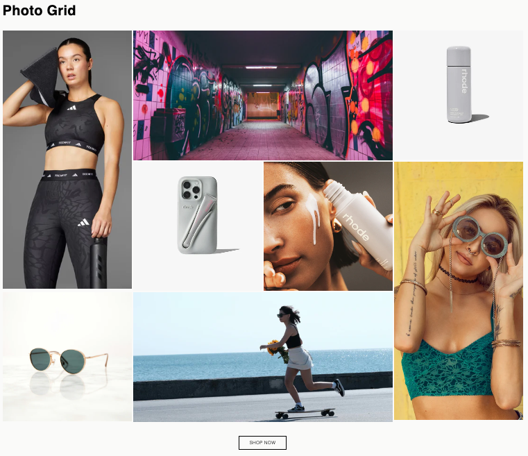
How to Add a Photo Grid Section to Your Shopify Store
By Nicholas Drishinski ·
This guide will walk you through adding a beautiful, customizable photo grid section to your Shopify theme. This section features a fixed 8-image layout with a mix of vertical, horizontal, and square images that automatically arrange into a perfect rectangle.
Prefer video?
Enjoy, otherwise read on!
What You'll Get
- A fixed 8-image grid layout that forms a perfect rectangle
- Mix of 2 vertical, 2 horizontal, and 4 square images
- Fully responsive design (mobile, tablet, desktop)
- Customizable grid spacing
- Optional heading and call-to-action button
- Elegant hover effects on images
- Theme color scheme integration
Prerequisites
Before you begin, make sure you have:
- Access to your Shopify theme files (you'll need to edit the theme code)
- Basic familiarity with file uploads
- Your Shopify theme editor access
Note: If you're working with a live theme, we recommend creating a duplicate theme first to test the changes.
Step 1: Access Your Theme Files
1. Log in to your Shopify admin panel
2. Navigate to **Online Store** → **Themes**
3. Find your active theme and click **Actions** → **Edit code**
- Or create a duplicate theme first for testing
Step 2: Add the Section File
1. In the theme editor, navigate to the **Sections** folder in the left sidebar
2. Click **Add a new section**
3. Name it exactly: `photo-grid.liquid`
4. Delete any default code in the file
5. Copy and paste the entire contents from the `sections/photo-grid.liquid` file
6. Click Save
Step 3: Add the CSS File
1. Navigate to the **Assets** folder in the left sidebar
2. Click **Add a new asset**
3. Select **Create a blank file**
4. Name it exactly: `section-photo-grid.css`
5. Delete any default code in the file
6. Copy and paste the entire contents from the `assets/section-photo-grid.css` file
7. Click Save
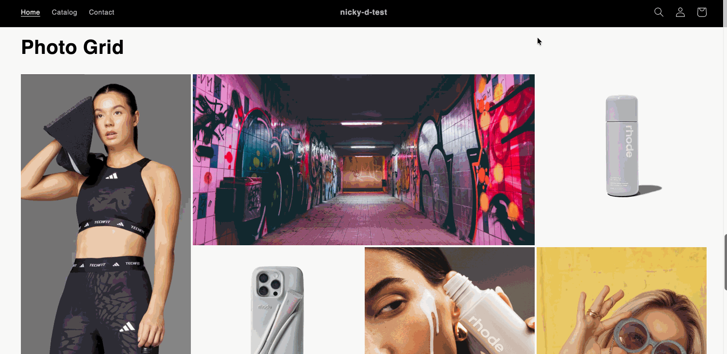
Step 4: Add the Section to a Page
Now that the files are uploaded, you can add the section to any page or template:
Option A: Add to a Page
1. Go to **Online Store** → **Pages**
2. Create a new page or edit an existing one
3. In the page editor, click **Add section**
4. Look for **Photo Grid** in the section list
5. Click to add it to your page
Option B: Add to Homepage
1. Go to **Online Store** → **Themes**
2. Click **Customize** on your theme
3. Navigate to the homepage template
4. Click **Add section**
5. Select **Photo Grid** from the list
6. Position it wherever you'd like on the page
Step 5: Configure Your Photo Grid
Once the section is added, you can configure it:
Upload Images
1. In the section settings, you'll see 8 image blocks
2. Click on each block to upload your images
3. The layout is fixed, so images will automatically arrange themselves:
- **Image 1**: Large vertical (left side, spans 2 rows)
- **Image 2**: Square (moves to row 2)
- **Image 3**: Square (moves to row 2)
- **Image 4**: Square (top right)
- **Image 5**: Horizontal (top row, spans 2 columns)
- **Image 6**: Square (bottom left)
- **Image 7**: Horizontal (bottom row, spans 2 columns)
- **Image 8**: Medium vertical (right side, spans 2 rows)
Optional Settings
- Add Links: Each image can link to a product, collection, or page
- Heading: Add an optional heading above the grid
- Grid Gap: Adjust spacing between images (default: 8px)
- Button: Add a call-to-action button below the grid
- Color Scheme: Match your theme's color schemes
- Padding: Adjust top and bottom spacing
Step 6: Customize the Layout
The section comes with preset sizes that create a balanced layout. While you can't change individual image sizes, you can:
- **Adjust Grid Gap**: Change the spacing between images (Settings → Grid gap)
- **Modify Button**: Edit the button label and link
- **Change Colors**: Select different color schemes to match your brand
Step 7: Save and Preview
1. Click **Save** in the theme customizer
2. Click **Preview** to see how it looks
3. Test on mobile, tablet, and desktop views
4. Make any final adjustments
Section Not Appearing
- **Check file names**: Make sure files are named exactly `photo-grid.liquid` and `section-photo-grid.css`
- **Verify file locations**: Section file should be in `/sections/`, CSS file should be in `/assets/`
- **Refresh**: Try refreshing the theme editor
Images Not Displaying
- **Check image uploads**: Make sure all images are properly uploaded
- **Image format**: Use common formats (JPG, PNG, WebP)
- **File size**: Ensure images aren't too large (Shopify has limits)
Layout Looks Off
- **Browser cache**: Clear your browser cache
- **Check spacing**: Adjust the grid gap setting if images look too close/far
- **Mobile view**: Check mobile responsiveness - the layout adapts on smaller screens
Button Styling Issues
- The button uses your theme's color variables
- It should automatically match your theme's color scheme
- If colors look wrong, check your theme's color settings
Conclusion
You now have a beautiful, customizable photo grid section that will enhance your Shopify store's visual appeal. The fixed layout ensures a perfect rectangle every time, and the responsive design works seamlessly across all devices.
Enjoy showcasing your products, collections, or brand imagery in this elegant grid format!