How to Add an Animated Hero Section to Your Shopify Theme Using GSAP

If you want to make your Shopify store stand out with motion and polish, an animated hero section is a perfect place to start. In this tutorial, we’ll walk through how to build a GSAP-powered hero section that updates both the background gradient and product image together as you scroll.
By the end, you’ll have a dynamic, eye-catching hero that looks like something out of a premium theme — all powered by a bit of JavaScript and animation magic.
Code: https://github.com/ndrishinski/blogs/blob/master/gsap-sneakers/sections/sneaker-hero.liquid
Prefer video?
Enjoy, otherwise read on!
Step 1: Create the Section File
In your duplicated Shopify theme, navigate to the 'Sections' directory and create a new file named animated-hero.liquid and paste in the following code:
    <div class="gsap-hero-wrapper">
  <div class="gsap-hero">
    <div class="gsap-hero-content">
      <h1>{{ section.settings.title }}</h1>
      <h2>{{ section.settings.heading2 }}</h2>
      <p>{{ section.settings.subtitle }}</p>
      <a href="#" class="gsap-hero-button">Shop Now
        <svg xmlns="http://www.w3.org/2000/svg" width="24" height="24" viewBox="0 0 24 24" fill="none" stroke="currentColor" stroke-width="2" stroke-linecap="round" stroke-linejoin="round" class="feather feather-arrow-right gsap-hero-button-icon">
          <line x1="5" y1="12" x2="19" y2="12"></line>
          <polyline points="12 5 19 12 12 19"></polyline>
        </svg>
    </a>
    </div>

    <div class="gsap-hero-image">
      <img src="{{ section.settings.image1 | image_url: width: 1000 }}" class="hero-img img1 active" alt="Image 1">
      <img src="{{ section.settings.image2 | image_url: width: 1000 }}" class="hero-img img2" alt="Image 2">
      <img src="{{ section.settings.image3 | image_url: width: 1000 }}" class="hero-img img3" alt="Image 3">
    </div>
  </div>
</div>


{% schema %}
{
  "name": "GSAP Hero",
  "settings": [
    {
      "type": "text",
      "id": "title",
      "label": "Heading",
      "default": "GSAP Hero"
    },
    {
      "type": "text",
      "id": "heading2",
      "label": "Subheading 2",
      "default": "You're going to love it"
    },
    {
      "type": "text",
      "id": "subtitle",
      "label": "Subheading",
      "default": "Scroll-triggered animations for Shopify stores."
    },
    {
      "type": "image_picker",
      "id": "image1",
      "label": "Image 1"
    },
    {
      "type": "image_picker",
      "id": "image2",
      "label": "Image 2"
    },
    {
      "type": "image_picker",
      "id": "image3",
      "label": "Image 3"
    },
    {
      "type": "color",
      "id": "color_1",
      "label": "Gradient 1 - Start",
      "default": "#000000"
    },
    {
      "type": "color",
      "id": "color_2",
      "label": "Gradient 1 - End",
      "default": "#222222"
    },
    {
      "type": "color",
      "id": "color_3",
      "label": "Gradient 2 - Start",
      "default": "#ff6a00"
    },
    {
      "type": "color",
      "id": "color_4",
      "label": "Gradient 2 - End",
      "default": "#ee0979"
    },
    {
      "type": "color",
      "id": "color_5",
      "label": "Gradient 3 - Start",
      "default": "#00c6ff"
    },
    {
      "type": "color",
      "id": "color_6",
      "label": "Gradient 3 - End",
      "default": "#0072ff"
    },
    {
      "type": "url",
      "id": "link_1",
      "label": "Link 1"
    },
    {
      "type": "url",
      "id": "link_2",
      "label": "Link 2"
    },
    {
      "type": "url",
      "id": "link_3",
      "label": "Link 3"
    }
  ],
  "presets": [
    {
      "name": "GSAP Hero"
    }
  ]
}
{% endschema %}
This code contains all of the HTML/Liquid and Schema settings required for our section.
Step 2: Add the Styles
Below the Liquid code, add the following <style> block:
<style>
  .gsap-hero-wrapper {
    position: relative;
  }

  .gsap-hero {
    top: 0;
    height: 100vh;
    width: 100%;
    display: flex;
    justify-content: space-between;
    align-items: center;
    overflow: hidden;
    padding: 0 5vw;
    color: #fff;
    background: linear-gradient(
      to right top,
      {{ section.settings.color_1 }},
      {{ section.settings.color_2 }}
    );
  }

  /* Blurred Content */
  .gsap-hero-content {
    background: rgba(255, 255, 255, 0.39);
    border-radius: 16px;
    box-shadow: 0 4px 30px rgba(0, 0, 0, 0.1);
    backdrop-filter: blur(10px);
    -webkit-backdrop-filter: blur(10px);
    border: 1px solid rgba(255, 255, 255, 0.81);
    max-width: 480px;
    padding: 3rem 3rem;
    border-radius: 16px;
    flex: 1;
    box-shadow: 0 8px 30px rgba(0, 0, 0, 0.4);
    display: flex;
    flex-direction: column;
    justify-content: center;
    gap: 2rem;
  }


  .gsap-hero-content h1 {
    font-size: clamp(2rem, 4vw, 4rem);
    font-weight: 700;
    color: #fff;
    margin: 0;
  }

  .gsap-hero-content h2 {
    font-size: clamp(1.5rem, 3vw, 3rem);
    font-weight: 700;
    color: #fff;
    margin: 0;
  }

  .gsap-hero-content p {
    font-size: clamp(1.5rem, 3vw, 2rem);
    line-height: 1.6;
    opacity: 0.9;
    margin: 0;
  }

  .gsap-hero-button {
    margin-top: 1rem;
    padding: 12px 28px;
    border-radius: 8px;
    background: #fff;
    color: #111;
    font-weight: 600;
    text-decoration: none;
    transition: all 0.3s ease;
    display: flex;
    align-items: center;
    justify-content: center;
    gap: 10px;
  }

  .gsap-hero-button-icon {
    visibility: hidden;
    margin-left: auto;
  }

  .gsap-hero-button:hover {
    transform: translateY(-2px);
    .gsap-hero-button-icon {
      visibility: visible;
    }
  }

  /* Image Styling */
  .gsap-hero-image {
    flex: 1;
    position: relative;
    height: 80%;
  }

  .gsap-hero-image img {
    position: absolute;
    top: 50%;
    left: 50%;
    transform: translate(-50%, -50%) scale(1);
    max-width: 80%;
    object-fit: contain;
    opacity: 0;
    filter: drop-shadow(0 20px 40px rgba(0, 0, 0, 0.4));
  }

  .gsap-hero-image img.active {
    opacity: 1;
  }

  @media (max-width: 900px) {
    .gsap-hero {
      flex-direction: column;
      height: auto;
      text-align: center;
      padding: 4rem 2rem;
      margin-top: -15px;
    }

    .gsap-hero-content {
      max-width: 100%;
      align-items: center;
      order: 1;
    }

    .gsap-hero-image {
      min-height: 350px;
      width: 100%;
      height: 100%;
      object-fit: cover;
      object-position: center;
  }

    .gsap-hero-image img {
      max-width: 100%;
      margin-top: 2rem;
    }

    .gsap-hero-button-icon {
      display: none;
    }
  }
</style>
This includes some references to our Shopify schema values and handles our responsive mobile design!
Step 3: Add GSAP Animation
    <script src="https://cdnjs.cloudflare.com/ajax/libs/gsap/3.12.5/gsap.min.js"></script>

    <script>
    document.addEventListener("DOMContentLoaded", () => {
      const hero = document.querySelector(".gsap-hero");
      const images = document.querySelectorAll(".hero-img");
      const button = document.querySelector(".gsap-hero-button");

      const gradients = [
        { from: "{{ section.settings.color_1 }}", to: "{{ section.settings.color_2 }}" },
        { from: "{{ section.settings.color_3 }}", to: "{{ section.settings.color_4 }}" },
        { from: "{{ section.settings.color_5 }}", to: "{{ section.settings.color_6 }}" },
      ];

      // 🔗 Define links for each slide
      const links = [
        "{{ section.settings.link_1 }}",
        "{{ section.settings.link_2 }}",
        "{{ section.settings.link_3 }}"
      ];

      // Initial state
      gsap.set(images, { opacity: 0 });
      gsap.set(images[0], { opacity: 1 });
      gsap.set(hero, { background: `linear-gradient(to right top, ${gradients[0].from}, ${gradients[0].to})` });
      button.href = links[0]; // Set initial link

      const tl = gsap.timeline({ repeat: -1, repeatDelay: 0, defaults: { ease: "power2.inOut" } });

      gradients.forEach((gradient, i) => {
        const nextIndex = (i + 1) % gradients.length;

        tl.to({}, { duration: 0.01, onStart: () => {
          // Background + image + button color + href all update together
          gsap.to(hero, {
            background: `linear-gradient(to right top, ${gradients[nextIndex].from}, ${gradients[nextIndex].to})`,
            duration: 3.5,
            ease: "power2.inOut"
          });
          gsap.to(images[i], { opacity: 0, duration: 3.5, ease: "power2.out" });
          gsap.to(images[nextIndex], { opacity: 1, duration: 3.5, ease: "power2.in" });
          gsap.to('.gsap-hero-button', { color: gradients[nextIndex].from, border: `1px solid ${gradients[nextIndex].from}`, duration: 3.5, ease: "power2.inOut" });

          // 🟢 Update the button link at the same moment
          button.href = links[nextIndex];
        }})
        .to({}, { duration: 3.5 }); // wait for transition to finish
      });
    });
    </script>
This JavaScript imports the GSAP library and the necessary code to animate our section!
Step 4: Add the Section to a Page
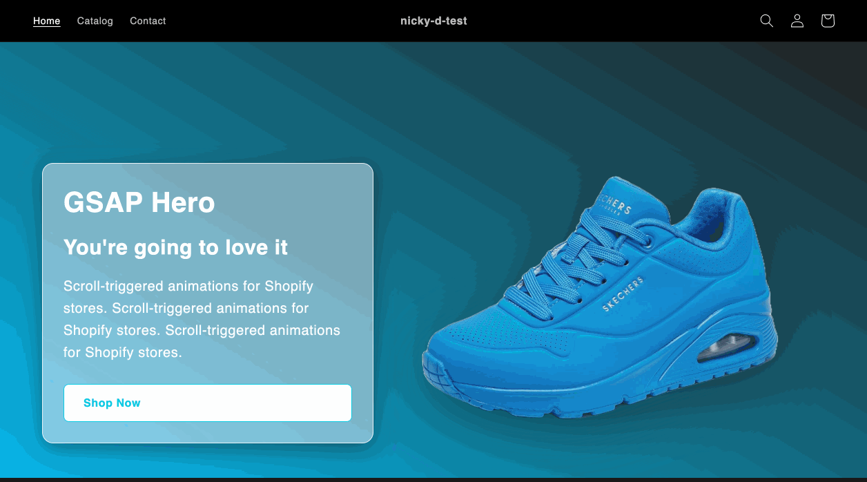
In the Theme Editor, you should now be able to add this section called 'GSAP-hero'. Then you will be able to customize it with your heading, subheading and paragraph text, three images and three sets of background color gradients.
Conclusion
GSAP adds a layer of refinement that makes your Shopify store feel alive. You can expand this setup with button color transitions, text animations, or even 3D effects.
If you’d like to dive deeper watch my full video walkthrough where I build this section step-by-step inside a Shopify theme.